
Your ads are only as good as the page they send people to. You can have the sharpest ad copy in the world, the tightest audience targeting, and a healthy budget behind it. But if your landing page falls flat, that traffic disappears. The clicks cost you the same. The conversions never arrive.
This is one of the most common patterns we see at Ardú Digital. Businesses spend thousands on Google Ads or Meta campaigns, send people to their homepage or a generic product page, and then wonder why the return on ad spend is so poor. The fix is rarely the ads. It is almost always the page.
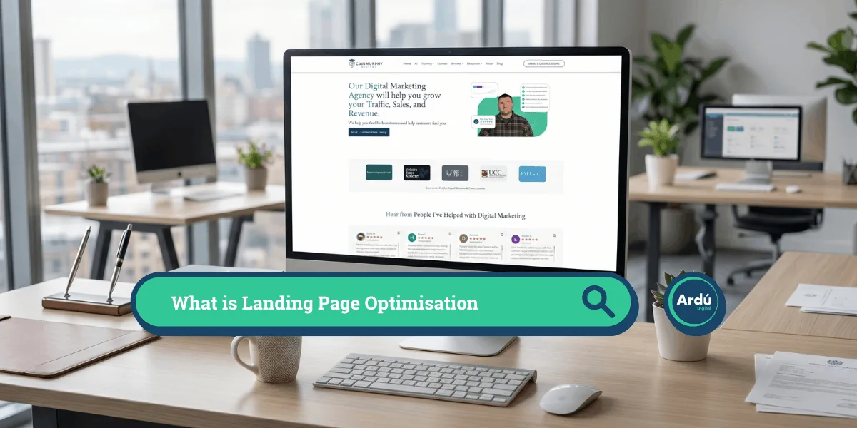
In this guide, we will walk through everything that should be on a landing page built for paid media in 2026. We will cover the structure, the copy, the trust signals, the forms, and the technical details. By the end, you will have a clear blueprint to build pages that turn paid clicks into customers.
What This Guide Covers
Here is a quick agenda so you know what is coming:
- Why landing pages matter so much for paid media in 2026
- The five-second test and what visitors decide above the fold
- Trust signals and social proof that actually move the needle
- How to write body copy that sells without sounding like a brochure
- Building forms that get filled in, not abandoned
- Technical and design rules that separate winners from losers
- A frequently asked questions section based on real search data
Let us get into it.
Why Landing Pages Are Non-Negotiable for Paid Media
A landing page is a standalone page built for one campaign and one goal. No menu, no footer links, no distractions. Just a single, focused journey from headline to conversion.
The numbers tell the story clearly. The median landing page conversion rate across all industries sits at 6.6%, but top performers achieve 10% or higher through systematic optimisation. The top 10% of pages convert at 11% or above, roughly three times the industry average.
That gap is huge. If you are running €5,000 a month on Google Ads at a 2% conversion rate, doubling that page to 4% effectively halves your cost per lead. You did not need more budget. You needed a better page.
A few more stats worth keeping in mind:
- Dedicated landing pages convert two to three times higher than generic product pages for paid traffic, because they match the ad’s specific message and remove navigation distractions.
- Every second of load time costs roughly 7% in conversions, with the critical threshold sitting at 2 seconds.
- Mobile drives 83% of traffic but converts 8% lower than desktop, which means mobile design has to be treated as the primary experience, not an afterthought.
- Reducing form fields to five or fewer doubles conversion rates. Each additional field beyond five represents a 20 to 30% conversion penalty.
The takeaway is simple. Sending paid traffic to your homepage in 2026 is a waste of money. A purpose-built landing page is not a nice-to-have. It is the asset that decides whether your campaigns make money or burn it.
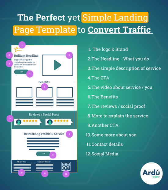
1. The Hero Section: You Have Five Seconds
Visitors decide within three to five seconds whether to stay or leave. That decision is made above the fold, before any scrolling. So everything in this section has to earn its place.
Headline That Matches the Ad
This is the single most important element on the page. Your headline must mirror the promise, keyword, or incentive in the ad that brought the visitor here. Marketers call this message match.
If your ad says “30% off our top-rated CRM,” your headline should say something close to “Get 30% off our top-rated CRM.” Not “Welcome to our software platform.” Not “The future of customer management.” The visitor came expecting one thing. Give it to them.
Message match also helps your Google Ads quality score, which lowers your cost per click. It is one of the few areas where a copy decision pays off in two ways at once.
Subheadline That Backs It Up
The subheadline supports the headline and removes doubt. It clarifies how you deliver the value. If the headline is the promise, the subheadline is the proof of concept. Keep it to one or two short sentences.
A Strong, Action-Oriented CTA
Your call-to-action button is where the conversion happens. The button should be prominent, contrasting in colour, and use action-oriented language. “Get my free quote” beats “Submit.” “Start my free trial” beats “Sign up.” Personalised CTAs convert significantly better than generic ones.
The button should also feel like a continuation of the offer, not a separate decision. The visitor is saying yes to the headline, not pressing a generic submit button.
A Real Hero Image or Video
Stock photos of smiling people in headsets do not work. Visitors can spot them instantly and tune them out. Use real images of your product, your team, or your customers. Authenticity outperforms polish.
Video can work well too. Landing pages featuring videos see an 86% increase in conversion rates, but only when the video has a clear job: explaining the product, showing it in action, or demonstrating the outcome. A vague brand video is just clutter.
Three to Five Benefit Bullets
Right under the headline and subheadline, list three to five short bullets that explain the main benefits. Not features. Benefits. The difference matters.
A feature is “256-bit encryption.” A benefit is “Your data stays private, always.” A feature is “12-month subscription.” A benefit is “A full year of support, all in.” Lead with what the customer gets, not with what your product does.
2. Trust Signals and Social Proof
People are sceptical online. They have been burned before. Your job is to prove you are legitimate within seconds, not to ask them to trust you.
Client Logos and Testimonials
If you work with recognisable brands, show their logos. A row of trusted client logos can do more for credibility than three paragraphs of copy. If you do not have big-name clients, use testimonials instead.
A good testimonial is specific, not generic. “Great service, would recommend” does nothing. “Ardú Digital cut our cost per lead by 38% in the first three months” does a lot. Always include a name, job title, company, and a real photo where possible.
Ratings and Review Badges
Trustpilot scores, Google review counts, industry awards, and recognised certifications all do heavy lifting. If you have “Best SaaS of 2026” or a 4.8 average from 200 reviews, put it on the page. Numbers and badges register faster than words.
Security and Reassurance Statements
Small reassurance lines reduce friction at the conversion point. Phrases like “No credit card required,” “Cancel anytime,” “GDPR compliant,” or “Your data is never shared” can lift conversions noticeably. SSL padlocks and trust badges near the form do the same job.
A useful test: stand in the shoes of a sceptical first-time visitor. What would make them hesitate? Address each of those hesitations directly with a small visual cue or one-liner.
3. Persuasive Body Copy: The Case
If the hero section earns the click, the body copy earns the trust. This is where you turn interest into intent. The structure should follow the way a real sales conversation flows.
Problem to Solution
Start by naming the problem the visitor is dealing with. “Tired of low engagement on your social posts?” “Struggling to get found on Google?” “Watching your ad spend disappear without leads?” When a visitor sees their own problem on the page, they keep reading.
Then explain how you solve it. Be concrete. Vague claims like “we deliver results” do not move people. Specific claims like “we help Irish businesses cut their cost per lead by an average of 30% in 90 days” do.
Make It Scannable
Almost no one reads every word. Most people scan. So write for scanning.
Use short paragraphs of two or three sentences. Use bullet points where it fits. Bold the most important phrases. Break up the page with clear subheadings. Pages written at a fifth to seventh-grade reading level achieve 11.1% conversion, nearly double the 5.3% rate for professional college-level copy. Simple wins.
Show Real Results
A short case study or before-and-after section is one of the most powerful pieces of body copy you can include. Quantify the result. “Client X doubled their leads in 30 days.” “Client Y reduced cost per acquisition by 42% across Q3.” Specific numbers feel real. Vague success stories feel made up.
Talk About Benefits, Not Features
This rule is so important it is worth saying twice. Lead with what the user gains. Features support the benefit. They do not replace it. Customers do not buy faster software. They buy the extra hours in their day.
4. Frictionless Lead Generation Forms
Your form is where the conversion happens. It is also where most pages fall apart. Every extra field is another reason to leave.
Keep Forms Short
The data here is consistent across every major study. Three-field forms convert at 10.1%, while nine-field forms drop to 3.6%. The steepest decline occurs between four and seven fields.
Ask for what you absolutely need to take the next step. Often that is just a name and an email. Job title, company size, and budget can all be qualified later, in a follow-up email or a call. Over-qualifying at the form stage is one of the most expensive landing page mistakes.
Use a Two-Step Form
Instead of showing the form straight away, use a button that opens the form in a modal or on the next view. This reduces the visual weight on the page and removes the immediate anxiety of seeing fields. Once a visitor clicks the button, they are already mentally committed to the next step.
Pick the Right Field Types
Where you can, replace open text fields with dropdowns, checkboxes, or radio buttons. They are faster to fill in, especially on mobile, and they reduce errors. Avoid mandatory phone number fields if you do not need them. They drop conversions noticeably.
Be careful with captchas too. Captcha challenges drop conversion by 3.2%, while invisible challenges drop conversion by only 0.4%. Use the invisible kind.
5. Technical and Design Essentials
This is the layer most people forget about, and it is often where the real losses happen. A beautifully designed landing page that loads in five seconds will lose to an ugly one that loads in one.
No Navigation, No Footer Links
Strip out the main website menu. Remove footer links to your blog, your team page, your full product range. Every link is an exit. The only journey on a landing page should be towards the conversion.
Single CTA landing pages convert at 13.5% versus 10.5% for pages with multiple CTAs, a 29% improvement from eliminating the paradox of choice.
You can keep your logo at the top, ideally not linked. That keeps the brand visible without creating an escape route.
Mobile-First Design
Mobile traffic now accounts for the majority of clicks on most paid campaigns. Your page must be designed for a phone first, not adapted to one.
That means buttons of at least 48 by 48 pixels. Fonts that are readable without zooming. Forms that work cleanly with autofill. Image sizes that do not blow out a 4G connection. Test the page on a real phone, not just a browser preview.
Fast Load Speed
Aim for a page that loads in under 2.4 seconds. A landing page with poor Core Web Vitals can pay 22% more per click than a fast competitor bidding on the same keyword. So speed is not just a UX issue. It is a budget issue.
The biggest wins usually come from compressing images, sorting out font loading, and removing render-blocking third-party scripts. If your page has six tracking pixels and four chat widgets, you are paying for that in conversions.
Tracking and Analytics
Make sure your tracking is in place before you turn the campaign on. That means GA4, Google Ads conversion tags, and your Meta pixel firing correctly on the right events. Without proper tracking, you cannot tell which ads are working, which keywords are wasted, or which audiences are converting. You are flying blind.
A common mistake is to set up the page, launch the campaign, and only check tracking a week later, when the data is already messy. Test before you launch.
Putting It All Together
A high-converting landing page is not a clever design exercise. It is a sequence of clear decisions, each one removing a reason to leave and adding a reason to convert.
Your hero section earns the next five seconds. Your trust signals earn the next twenty. Your body copy earns the scroll. Your form earns the click. Your technical setup earns the budget back.
If you are running paid media to your homepage right now, this is the single change most likely to lift your return on ad spend in the next quarter. Build the page. Match the ad. Strip the noise. Track the results.
If you would like a hand with that, this is exactly what we do at Ardú Digital. We build paid media campaigns and the landing pages that go with them, with full transparency on every hour of work. Get in touch and we will take a look at your current setup.
Frequently Asked Questions
What is a good conversion rate for a landing page?
The median landing page conversion rate sits at around 6.6%, but it varies a lot by industry. SaaS averages closer to 3.8%, financial services around 8.4%, and events around 12%. A useful rule of thumb is to aim for 20% above your industry median. Anything in the top 10% will be converting at 11% or higher.
How long should a landing page be?
It depends on the offer. A simple lead magnet like a free guide can work with a short page of one or two screens. A higher-commitment offer, like a demo or a paid product, usually needs more detail, more social proof, and more reassurance. Length is not the issue. Relevance is.
Do I need a separate landing page for every campaign?
In most cases, yes. The whole point of a landing page is message match between the ad and the page. If you are running three different ad campaigns with three different offers, sending all of them to the same page dilutes the relevance and hurts conversions. Multiple focused pages almost always beat one general page.
Should a landing page have a navigation menu?
No. Removing the main menu is one of the simplest ways to lift conversions on a paid media page. Every link in a navigation bar is a way out. Your logo at the top is fine. A full menu is not.
How many form fields should a landing page have?
Fewer than you think. Three to five fields is the sweet spot for most lead generation pages. Each field beyond that drops your conversion rate by a noticeable margin. Ask for the minimum you need to take the next step, and qualify the lead later.
How much does a landing page cost in Ireland?
It depends on the complexity, the design, and whether you are using a builder or a custom build. A simple page on a builder like Unbounce or Webflow can be live for a few hundred euro a month all-in. A fully custom, integrated page with tracking, A/B testing, and design work can run into the low thousands. The bigger question is what it earns back, not what it costs.
What is the difference between a landing page and a website?
A website is built for many audiences and many goals. A landing page is built for one audience and one goal. The website is your shop. The landing page is the till.
How do I know if my landing page is working?
Look at three numbers. The conversion rate, the cost per conversion, and the bounce rate. If your conversion rate is below your industry median, the page is the issue. If your cost per conversion is too high, it is either the page or the targeting. If your bounce rate is over 80% on paid traffic, the message match between your ad and your page is probably broken.
How often should I update my landing page?
Treat it as a living asset. Refresh headlines, visuals, and offers every few months, and run small A/B tests on the highest-impact elements: headline, hero image, primary CTA, and form.
Most tests will not produce a winner, but the ones that do can deliver large gains. The pages you set and forget are the pages that quietly slip down the rankings of your own ad account.
Why is my landing page conversion rate so low?
The most common cause is a mismatch between the ad and the page. The visitor was promised one thing, and the page delivered something more generic. Check that your ad headline and your page headline are saying the same thing. Then check page speed, form length, mobile design, and the strength of your social proof. In nine out of ten low-converting pages, the issue is one of those.
If you have read this far and you are looking at your own landing pages thinking they could do more, you are probably right. We help businesses across Cork, Dublin, Galway, and the rest of Ireland get more out of their paid media through better pages, better tracking, and better strategy. Get in touch with Ardú Digital and we will walk through your setup with you.